Skip to main content
Telephone:
202.660.2940
Email:
[email protected]
Menu
Home
About
Certifications
Services
Clients
Insights
Home
Insights
Insights
Insights
3 Ways to Improve Your Site Through a Drupal 7 Migration
By
Blake Newman
Drupal
,
Migrating Out of Drupal 7
,
The Agile Podcast
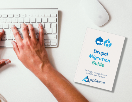
Estimating the Cost of a Drupal 7 Migration
By
Blake Newman
Agile Software Development
,
Drupal
,
Migrating Out of Drupal 7
,
The Agile Podcast
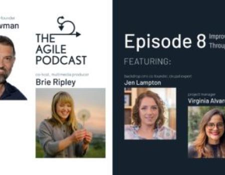
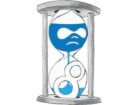
The Agile Podcast Episode 8: Improving Your Site Through a Migration
By
Blake Newman
Agile Software Development
,
Drupal
,
Migrating Out of Drupal 7
,
The Agile Podcast
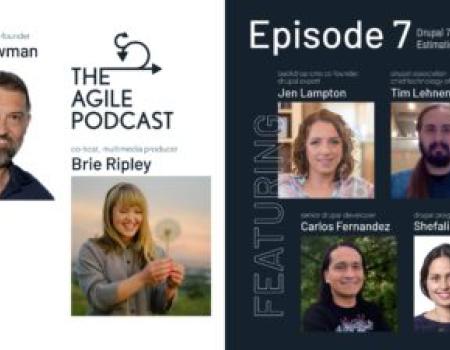
The Agile Podcast Episode 7: Estimating Time and Money for a Drupal 7 Migration
By
Blake Newman
Agile Software Development
,
Drupal
,
Migrating Out of Drupal 7
,
The Agile Podcast
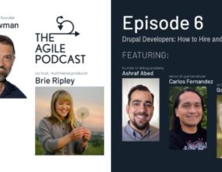
The Agile Podcast Episode 6: Drupal Developers, How to Hire and Who to Hire
By
Blake Newman
Drupal
,
Migrating Out of Drupal 7
,
The Agile Podcast
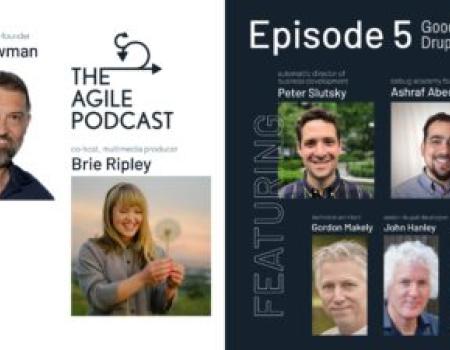
The Agile Podcast: Episode 5 – Goodbye Drupal
By
Blake Newman
Drupal
,
Government Websites
,
Migrating Out of Drupal 7
,
The Agile Podcast
,
WordPress
,
WordPress Web Designer in Washington DC
Drupal Association CTO Tim Lehnen on Drupal 7 End of Life (EOL) and Why Upgrading to D8 and D9 is Worth the Effort
By
Blake Newman
Agile Software Development
,
Drupal
,
Migrating Out of Drupal 7
,
The Agile Podcast
After Biden's Inauguration, Will WhiteHouse.gov Be Powered by WordPress, Drupal ... Or Something Else?
By
Blake Newman
Agile Software Development
,
Drupal
,
Government Contracting
,
Government Websites
,
The Agile Podcast
,
WordPress
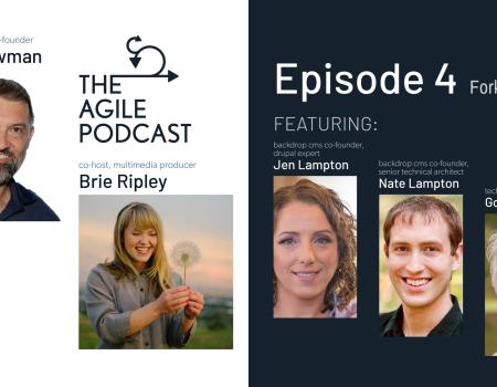
The Agile Podcast: Episode 4 - Fork the Code (Backdrop CMS)
By
Blake Newman
Drupal
,
Migrating Out of Drupal 7
,
The Agile Podcast
1
2
Next